Friday, May 29, 2015

Friday Flashback: Watercolor Minis

Happy Friday, peeps!  It's Day 2 of the Snapdragon Stamps move-a-thon, but luckily I made a card (two, actually) for today's Flashback earlier this week.  Starting next week I'll be going to a Tuesday-Thursday-Saturday post schedule until we get to the next house and I get my craft room set up again.  But for today, let's check out Watercolor Minis!

Also features Sage Advice
I remember that this one was super-fiddly when I made it, trying to get all the quilt blocks on the edges trimmed exactly right.  I liked the effect, but I never made another card like this ;)

Also features Filigree and Sincere Salutations


Also features Filigree and Sincere Salutations (again)
Ok, for some reason I can't manage to get any text in between these two cards but they're the same except for colors anyway.  I still miss Eggplant Envy; it was a couple shades lighter than the current Elegant Eggplant.  I love Elegant Eggplant, but sometimes it comes off so dark that it's hard to distinguish from black.

Also features All-Year Cheer and Roses in Winter
I liked using the roses in Watercolor Minis as the tiny version of the roses in Roses in Winter, as you can see here.  And that's the Flashback, so here are today's two new cards:


I knew I had used the rose a lot, but maybe not the tulip, so I decided to do a kinda CAS design with the tulip stamps.  But after I made this one on Sahara Sand, I wasn't sure I liked how the colors turned out on top of the colored cardstock, so I made a second one with a Whisper White card base.


Just a little brighter, and doesn't muddy up the tulip colors.  Once again I used an older layout from Clean & Simple Stamping:


And that's all she wrote this week.  Have a great weekend, peeps!

Supplies, last two cards only:
Stamps:  Watercolor Minis, Elegant Cheer
Ink:  Pink Pirouette, Strawberry Slush, Old Olive, Blackberry Bliss
Paper:  Sahara Sand, Whisper White, Something Borrowed DSP
Accessories:  Blackberry Bliss ribbon

Thursday, May 28, 2015

Aca-Awesome

I must confess:  up until last week, I'd never seen the movie Pitch Perfect.  My friend Ashlea insisted that I had to see it, I would love it, and it would change my life.  Not sure it's life-changing, but I do love it :)  And as it happens I needed a thank you card for Ashlea so I couldn't resist making a Pitch Perfect-inspired card.


If you've never seen the movie (Mom), it's about an all-girls college a capella group, and the characters have a habit of adding aca- to random words.  Aca-people.  Aca-awkward.  Aca-babies.  Aca-scuse me (probably my favorite).  And of course aca-awesome.  And I put a cupcake on it because Ashlea loves cupcakes just as much as she loves Blue Bell ice cream, and also I got her a gift card to Gigi's Cupcakes.

I managed to squeeze in making this card yesterday when I was supposed to be prepping for the movers to get here today, but it was pretty quick to make thanks to Freshly Made Sketches.  But I was still in a hurry and that's why my cupcake is off-center; I couldn't peel up the Dimensionals and fix it :(  But that's part of the handmade charm, right?


And of course this also counts for the same SUO Sweet Treats challenge as yesterday's card.  Ok, I've got about an hour and a half before the movers show up.  Better get cleaned up and ready to go...cheers, peeps!

Supplies, all SU!
Stamps:  Yippee-Skippee!, Calendar Alphabet & Numbers
Ink:  Coastal Cabana, Blackberry Bliss
Paper:  Coastal Cabana, Blackberry Bliss, Strawberry Slush DSP & cardstock
Accessories:  Cupcake builder punch, Itty Bitty Punch Pack heart, Dimensionals

Wednesday, May 27, 2015

Mmm...Donuts

Well, peeps, I've got one day left before the packers get here tomorrow morning, and I've got a lot to do.  But before I get started on my mile-long to-do list, here's today's card:


The donuts are actually punched out of the Cherry on Top DSP :)  There's going to be a stamp set in the new catalog (which goes live next week!) that has donuts to match these, but it wasn't part of the preorder.  Truth be told, donuts aren't really my thing anyway, though I think they're cute on this card.  Give me a brownie any day.  Anywha, I thought the "so sweet" sentiment was appropriate for this, though I wish it had stamped a little bit more crisply.  Sometimes I have a problem with that when it comes to photopolymer stamps.

I'm entering this over at SUO Challenges since their latest challenge is all about sweet treats.

Okay, time to get moving.  Literally...my first task is to get my daily run done and then eat breakfast (which will not involve donuts or brownies, sadly).  Cheers, peeps!

Supplies, all SU!
Stamps:  Hello Life
Ink:  Watermelon Wonder
Paper:  Pool Party, Bermuda Bay, Cherry on Top DSP
Accessories:  3/4" circle punch

Tuesday, May 26, 2015

Nachos: Hello Love

Happy Tuesday!  It is time once more for a Nacho Average Sketch Challenge, woohoo!  Check it out:


Once again, a great sketch that you can use to make a CAS card or gussy it up to something fancy.  I stayed more on the CAS end of the spectrum:


I don't know why I waited so long to get the hostess set Hello Love, it's super cute.  So I'm using it as much as I can before all the stamps retire.  And the colors, I used Strawberry Slush for my card base and some retiring Confetti Celebration DSP.

Now it's time for you to check out the Nacho blog and upload your own sketchariffic creation.  Can't wait to see what you come up with.  Cheers, peeps!

Supplies, all SU!
Stamps:  Hello Love
Ink:  Bermuda Bay, Strawberry Slush
Paper:  Strawberry Slush, Whisper White, Confetti Celebration DSP
Accessories:  Circles Framelits, Neutrals Candy Dots, Dimensionals

Monday, May 25, 2015

Caen

Good morning, folks!  Time already to start another week.  I don't have any scrapbook layouts that really tie in to Memorial Day, so I thought I'd share this one from when we toured Normandy since we did visit the D-Day beaches and the American cemetery there.  Of course, I haven't scrapped those pics yet but I do have this:


See the original pics here.  We stopped in Caen for a couple of hours on our way back to Paris, ate dinner and saw the castle of William the Conqueror.  And also that cool statue of Joan of Arc on the left page.  One day I'd like to go to Rouen and see more historical stuff.  Anyway, here's a closeup of the title:


The outside frame is one stamp, and then of course the letters and crown are separate stamps too.  I like how it turned out.


And there's my color palette:  Smoky Slate, Basic Gray, Real Red, and a smidge of Hello Honey.  I'm off to do my first run of the week and then work more on prepping the house for the packers on Thursday.  Time is running short!  Cheers, peeps!

Supplies, all SU!
Stamps:  Elementary Elegance, Rough Type, Wing It, Carte Postale
Ink:  Smoky Slate, Basic Gray, Hello Honey
Paper:  Smoky Slate, Basic Gray, Hello Honey, Real Red, Real Red DSP
Accessories:  Curly Label punch

Friday, May 22, 2015

Friday Flashback: Of the Earth

Happy Friday, peeps!  And woohoo for the Friday Flashback!  Today's randomly selected retired stamp set (RSRSS, haha) is Of the Earth, which is a lovely hostess set from the 2009-2010 SU! catalog.  To my consternation, I looked in my archives and discovered that I had NEVER used this stamp set, and that was just such a shame that I created no fewer than three cards for today!  So let's get to the all-new Flashback :)


The bird image is from Of the Earth, and the sentiment stamp is from my much-loved Pursuit of Happiness.  If you're wondering, I stamped the birds offset and sometimes a little crooked on purpose because I knew I wouldn't get them lined up perfectly if I tried.  For this card, I used this Retro Sketch:


And this color combo from the Color Throwdown, which I absolutely love and adore:


I used Crushed Curry, Chocolate Chip, Coastal Cabana, and Bermuda Bay for my colors.

And here is card number two:


The circular image with the butterfly (haha, you cannot escape the butterflies!) is from today's featured stamp set, and the sentiment is from Perfectly Penned which I still love and adore.  The Friday Flashbacks are always fun to dust off some old favorite stamps and play with them again.  Anywha, my color combination on this one is courtesy of Create with Connie and Mary:


Isn't that pretty?  I'm also entering this card over at The Paper Players:


Yes, my card has a few layers on it, but I still think my design was pretty CAS.  I tried stamping a background on the card base and just didn't like it as well, so I left it plain and simple.  I also used this week's sketch from Freshly Made Sketches, can't leave them out:


And for my last card...


I really like the idea of stamping the same image in different colors like that.  I used the very first Fall-To Layout from Clean & Simple Stamping:


Trying to tie that bow in the baker's twine was a trial, let me tell you.  I also used a recent color combination from Just Add Ink, but that challenge is already closed:


I used to not really like Calypso Coral, but I seem to be using it a lot lately.  Maybe 'cause I love it with Sahara Sand, or Coastal Cabana, or Daffodil Delight.  Most colors I don't like much, I eventually come around to and end up loving.  But not always :)

Ok, I've procrastinated long enough...it's time to help the hubs with our prep for moving.  Oy.  But hey, if we get a lot done this weekend then maybe I can squeeze in some more stamping and scrapping before the packers arrive on Thursday.  Hope springs eternal!

Cheers, peeps!

Supplies, first card:
Stamps:  Of the Earth, Pursuit of Happiness
Ink:  Crushed Curry, Chocolate Chip, Coastal Cabana, Bermuda Bay
Paper:  Coastal Cabana, Whisper White, Flowerpot DSP
Accessories:  Neutrals Candy Dots

Supplies, second card:
Stamps:  Of the Earth, Perfectly Penned
Ink:  Blackberry Bliss
Paper:  Soft Sky, Blackberry Bliss, Smoky Slate, Whisper White, Eastern Elegance DSP
Accessories:  1 3/4" circle punch, Circles Framelits, ticket corner punch, Dimensionals

Supplies, third card:
Stamps:  Of the Earth
Ink:  Crumb Cake, Calypso Coral, Pool Party, Pear Pizzazz, Chocolate Chip
Paper:  Crumb Cake, Calypso Coral, Pool Party, Pear Pizzazz, Chocolate Chip
Accessories:  1 1/4" square punch, Calypso Coral baker's twine

Thursday, May 21, 2015

Sunny Butterfly

I think I'm on a butterfly kick...this is two days in a row.  It's only going to get worse, too--one of the top three stamp sets I can't wait to get my hot little hands on in the new catty is all about the butterflies.  And new butterfly Framelits.  But for now let's have a sunny day:


I inked up the sentiment stamp in Pear Pizzazz and used a Q-Tip to remove the color from a couple of key words, which I then colored with a Bermuda Bay marker.  I don't think I quite got all the Pear Pizzazz ink off though, because parts of the Bermuda words have a distinct greenish cast.  But I'm all like hey, it's an extra color freebie!

Speaking of colors (or should I say colours?), I got this awesome colour palette from Colour Me...!


They're having a design team call right now and I was thinking that I'd love to put my hat in the ring to try out for it, but we're moving in a couple of weeks.  But then I just saw that the DT commitment doesn't start until July, and that might be doable.  Hmm...

Anywha, I also used the sketch from Fab Friday:


I love how there are different challenges every day of the week; my only problem is that a lot of times I need an extra six or seven days in the week to play in all of them, even with combining two or three at a time.  Life is so tough ;)

Hope you have a sunny day, peeps!  We're off to my hubs' cousin's high school graduation tonight.  I'll be wearing a fun springy floral dress.  Cheers!

Supplies, all SU!
Stamps:  Butterfly Basics, Feel Goods, Hello Love
Ink:  Pear Pizzazz, So Saffron, Bermuda Bay
Paper:  Pear Pizzazz, So Saffron, Bermuda Bay, Whisper White
Accessories:  Butterflies Thinlits, Subtles Candy Dot, Dimensionals

P.S.  I now have the theme song to Sesame Street stuck in my head.  "Sunny days...."

Wednesday, May 20, 2015

Happy Butterfly

Salutations and greetings, friends!  Just trying out a new greeting.  It is a sunny Wednesday morning here and I just so happen to have a sunny card to share.


See?  Sunny.  I'm loving Daffodil Delight lately.  For my butterfly, I got some watercolor paper and did a wash on it with Daffodil Delight and Tangerine Tango ink refills, though I kinda wish I'd sponged the edges of the butterfly a little to give them more definition.  I wanted a solid butterfly, so I cut out one of the fancy butterfly Thinlits and then used the negative shape to trace the butterfly on the back of my watercolor paper (so then I could cut it out and not have to worry about pen lines on the edges).  The sentiment is from the soon-to-retire hostess set Hello Love, which I got last month and hadn't used at all yet; it's got some cute images so I do hope to get something made with it in the next couple weeks.

Anyway, the super cheerful color combo is courtesy of ColourQ:


And I used the latest Sketch Frenzy Friday sketch:


I stuck very close to the sketch this time :D

Anyway, lots to do today so I'd better get a move on.  Cheers, peeps!

Supplies, all SU!
Stamps:  Hello Love, Flower Patch
Ink:  Tangerine Tango, Daffodil Delight
Paper:  Daffodil Delight, Strawberry Slush, Whisper White, watercolor paper, Coastal Cabana DSP
Accessories:  Butterfly Thinlits, Banners Framelits, hexagon punch, Dimensionals

Tuesday, May 19, 2015

Nachos: CAS Kindness

Happy Nacho day, peeps!  It is time once again for an awesome Nacho Average Color Challenge:


I admit, I had to put on my thinking cap for this one...I am not necessarily a fan of Strawberry Slush and Crisp Cantaloupe together.  And then I layered them one on top of the other on my card and I like it, so there's a lesson for you:  try the color challenge even if you're not sure about it :)


We're moving in less than a month, so I may be going more CAS with my creations for a while.  Once I chose the retiring Too Kind for my card, I came up with this super-simple layout and I was done with this card in, like, five minutes.  You might notice that I did sneak in a new color...the flower stems are stamped with Mint Macaron, one of the upcoming new In Colors.

Now it's your turn!  Upload your beautiful creation at the Nacho blog for us to see :)  Cheers, peeps!

Supplies, all SU!
Stamps:  Too Kind
Ink:  Strawberry Slush, Crisp Cantaloupe, Coastal Cabana, Mint Macaron
Paper:  Strawberry Slush, Whisper White, Coastal Cabana DSP
Accessories:  None

Monday, May 18, 2015

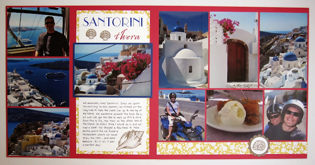
Santorini

Mornin', y'all!  I spent the weekend in Okefenokee Swamp in Georgia, getting bit by mosquitoes and taking pictures of alligators.  But for today I have a new scrapbook layout to share from Santorini, Greece.


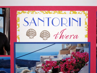
See the original pics here and here.  This was actually the first thing I used any of the new In Colors on--the sea shells are stamped in Tip Top Taupe.  How 'bout a closeup of the title:


This is another layout from our Med cruise in 2013, and I used that same mix of alphabet stamps for the other Greece layouts so I'm being consistent here.  Thera (or Thira) is an older name for Santorini.


My very bright color combination:  Melon Mambo, Brilliant Blue (sometime soon I'm going to run out of this color and then I may cry), Daffodil Delight, Tip Top Taupe, and Whisper White.

It's Monday morning so it's time to get in my first run of the week.  Check ya later, peeps!

Supplies, all SU!
Stamps:  Empire Alphabet, Spencerian Alphabet, Stippled Shells
Ink:  Brilliant Blue, Melon Mambo, Tip Top Taupe, Night of Navy marker
Paper:  Melon Mambo, Brilliant Blue, Tip Top Taupe, Whisper White, Beyond the Garden DSP
Accessories:  circle & scallop circle punches

Friday, May 15, 2015

Friday Flashback: Service & Sacrifice

Happy Friday, peeps!  Welcome to this week's Friday Flashback.  Our stamp set today is Service & Sacrifice, which is pretty appropriate given that Memorial Day is right around the corner.  Honestly, I'm a little surprised at how short the flashback is today, so let's get to it.

Also features For Your Country, World Map, Bright & Beautiful
I shared this one just a few months ago.  Most of the stamps in Service & Sacrifice are sentiment stamps, and apparently I really like that promotion one...

Also features Bright & Beautiful
Because here it is again, another card that you saw here in the past few months.  I could have sworn I had used Service & Sacrifice on other projects, but if I did, the Archive Gremlin has hidden them (or eaten them).  So here's today's new project:


Again with the promotion stamp, but this time I added the stars :)  The boots are, once again, from For Your Country and I think it's the only stamp I've used from that set.  What, sometimes I have just one favorite from a set.

I used this week's CAS(E) This Sketch:


Only when I copied it down, somehow I had all the elements centered on the card front instead of being a bit lower down.  Well, I tried.

My color combination is courtesy of a new-to-me challenge, The Male Room:


Mossy Meadow, Crumb Cake, and Lost Lagoon.  Their challenge is all about making projects for the dudes:  MAN cards, MANLY scrapbook pages, etc.  Yeah, those are hard, so a challenge all about guys is probably a good idea.  So for my manly man card today, I kept it very simple with just plain cardstock.  No patterned paper, no ribbon, no froufrou embellishments, just manly cardstock and stamps.  :)

That's it for me this week, peeps.  I'm leaving in a few hours to do a photography workshop in Georgia.  Cheers!

Supplies, last card only:
Stamps:  Service & Sacrifice, For Your Country
Ink:  Lost Lagoon, Mossy Meadow, Crumb Cake
Paper:  Lost Lagoon, Mossy Meadow, Crumb Cake, Very Vanilla
Accessories:  Circles & Starburst Framelits

Thursday, May 14, 2015

New Colors! Squeeee!

So I finally got my new catty preorder yesterday!  But Mr. Brown delivers late in this area, so I got it around 4:30 (which is actually early for UPS at this house) and then I was working on two different scrapbook layouts and I had book club last night and basically I didn't get to play with any of the new colors until this morning.  So feast your eyes!


The two new colors here are Cucumber Crush and Watermelon Wonder, and that patterned paper is from the new Cherry on Top 6x6 paper stack.  LOVE IT.  I'm mixing the incoming colors with some outgoing stamps, both Mixed Bunch and Four You are retiring.

My quick and easy card is thanks to this wonderful Freshly Made Sketch:

And of course the blossom punch that coordinated with my flower stamp.  Easy peasy lemon squeezy!

I'm off for a Skype date with Missy and then more quality time with these new In Colors.  Cheers, peeps!

Supplies, all SU!
Stamps:  Mixed Bunch, Four You
Ink:  Watermelon Wonder, Bermuda Bay, Cucumber Crush
Paper:  Cucumber Crush, Whisper White, Cherry On Top DSP Stack
Accessories:  blossom punch, 1" circle punch, Dimensionals, rhinestone

Wednesday, May 13, 2015

Distressed Butterfly Basics

Once again I have not gotten enough sleep...and this time it is totally my girl Sadie's fault (she's one of our black Labs, if you don't remember).  She was making noise in the middle of the night and woke up both me and the hubs, and then she went back to sleep and was merrily snoring away while I was staring at the ceiling *wishing* I was asleep.  Grr, Sadie.  Grr.

Luckily I made this card yesterday.


Let's all rejoice that Butterfly Basics will be sticking around for a while since it's in the new catalog, shall we?  (And let's also rejoice that I will finally get the new In Colors in my hot little hands today...now if only Mr. Brown delivered here *before* 6 p.m.  Sigh.)

Anyway, I made this card for no fewer than three challenges, starting with the Inkspirational recipe challenge.


The recipe is to use at least three of these four elements:  distressing, flowers, embossing, and pearls.  The one I didn't use is embossing; for the distressing I stamped the three small flowers on the Sahara Sand cardstock, then crumpled it up good.  I smoothed it back out and hit it with some Sahara Sand ink, and if you try this at home I recommend a good strong adhesive for any crumply layers because SNAIL just won't cut it.  I'm thinking liquid adhesive or Sticky Strip.  Or Dimensionals.  But anyway, that crumpled layer does add dimension and texture IRL even if you can't really tell in the pic.

I also used the color combo from The Paper Players:


Sometimes it seems like everyone else in the stamping world is in love with Crumb Cake as a neutral, but Sahara Sand has always been my personal favorite so I'm glad to see it pop up in color challenges on occasion.  And of course Lost Lagoon and Pistachio Pudding are my colors.

Finally, I used this week's Retro Sketch:


And that's all she wrote today.  Can't go back to sleep now so I might as well lace up my shoes and go running...

Cheers, peeps!

Supplies, all SU!
Stamps:  Butterfly Basics
Ink:  Pistachio Pudding, Lost Lagoon, Sahara Sand
Paper:  Pistachio Pudding, Lost Lagoon, Sahara Sand, Very Vanilla
Accessories:  Bitty Butterfly punch, 1" circle punch, scalloped border punch (soon to retire!), pearls, Dimensionals

Tuesday, May 12, 2015

Nachos: Tangerine Hello

Howdy, peeps!  It is time once again for a Nacho Average sketch challenge, and here it is:


So you could do this super-clean and simple, or dress it up a bit like I did:


I chose some DSP that I juts love and used the Hello You Thinlits to cut out a "hello" from Tangerine Tango cardstock so the DSP would show through.  I think this card is a little brighter and more sunshiney IRL :)  Ironically, today is the only day in about the past two weeks that we're expecting to get thunderstorms.

It's your turn now!  Go check out the other lovelies on the Nacho blog and post your own creation there.  Cheers, peeps!

Supplies, all SU!
Stamps:  Flower Shop, Crazy About You
Ink:  Blushing Bride, Tangerine Tango
Paper:  Crushed Curry, Tangerine Tango, Whisper White, Flowerpot DSP
Accessories:  Hello You Thinlits, Pansy punch, Best Year Ever Accessories pack buttons, Dimensionals

Monday, May 11, 2015

I Shall Miss England

Mornin', peeps!  Oyyy, I stayed up too late last night :(  Still gotta get with it this morning and go do my run!  But first let's check out some scrapbook pages from about a year ago.


This is a field and an old church that wasn't too far away from our house in England; see the original pics here.  While going through my 12x12 cardstock a while ago, I discovered I have an entire package of Pale Plum and I'd never even opened it, so I broke it out for last week's Time for Tea layout and this one.  One of the advantages of scrapping non-chronologically is I can use a color combo I like on multiple layouts and they won't be close to each other :)


Title closeup.  The patterned paper is Summer Starfruit, which was a big surprise for me--I was actually looking for a pattern in green (I was going to try Gumball Green or Wild Wasabi) and neither one of the greens was working, but somehow the Summer Starfruit just seemed to work.  It was a surprise because it's not a color I gravitate toward at ALL.  But I like it on here!


My color palette:  Pale Plum, Orchid Opulence, Summer Starfruit, Handsome Hunter, Wild Wasabi, and Very Vanilla.  Love me some purple and green together.

Alrighty then, I suppose I should go lace up my running shoes.  Cheers, peeps!

Supplies, mostly SU!
Stamps:  Nature's Pace
Ink:  Wild Wasabi, Orchid Opulence, Elegant Eggplant marker
Paper:  Pale Plum, Orchid Opulence, Handsome Hunter, Very Vanilla, Summer Starfruit DSP
Accessories:  Circle punches, Modern Label punch, lettering template