Saturday, December 31, 2016

Scrappy Showcase, Part 1

ETA:  this was supposed to show up on Saturday morning but it looks like it's already published.  So happy early new year?

Last day of the year, y'all!  And thus begins my 2016 scrappy showcase.  Since I usually only post one scrapbook layout per week, sometimes it takes quite a while between when I make one and when I post it so I didn't necessarily make all of these this year.  BUT I did complete 142 pages, so hooray for me!  My goal was 100, so I passed it by a bit :)  Anyway, let's get going!


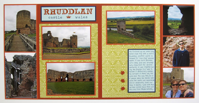
First up is this layout from the last castle we visited in Wales; I love the dark orange colors contrasted with the green and blues.


Next is my scrappy ode to Disney's greatest villain, all pics taken at Disneyland Paris.  Again I love the colors with the photos plus it's Maleficent, can't go wrong there.


Next up is this snowy layout from England; I got the color combination of Island Indigo, Baja Breeze, and Rich Razzleberry from the old Color Coach.  I never would have put those three colors together on my own but I love the combination so much that I've used it several times on baby books too.


And the final layout for today is this New Years layout, appropriate no?  No Rock Band parties for us this year though, we'll be staying in tonight.

More scrappy goodness coming up in the next few days.  Hope you have a wonderful New Year's Eve and stay safe, y'all!

Friday, December 30, 2016

2016 Showcase, Part 3

Mornin' kids, welcome to the last post in the 2016 showcase, at least for cards.  I think I'll pick out some favorite scrapbook layouts over the next few days too because it's fun to go back and look at those (which is the whole reason I make them, right?).  So let's get started.


October's pick is this Halloween card featuring Agnes, whom I dearly love (along with her pals Frankie and Vlad).


Here's a pretty Thanksgiving card for November's pick.


And I really liked two cards for December, the first one being this Christmas Magic train.


And my other favorite is this CAS snowflake card.  That wraps up the card showcase for 2016, hope you enjoyed it!

Thursday, December 29, 2016

2016 Showcase, Part 2

Time for Part 2 of my favorite projects from 2016.  Let's dive right in, shall we?


Love this bright and cheery card for May.


June's pick is this Millennium Falcon card, might not be the prettiest thing ever but I'm rather proud of it given that I don't do much punch art.  And I watched The Empire Strikes Back last night in honor of Carrie Fisher.


For July I chose this flamingo card, love the bright colors and I need to break out that stamp set again soon.


And the last card for today is August's jellyfish.  I admit the main image is a little indistinct with the clear EP, but I loved the idea of it and how the "sand" on the background turned out.

Part 3 coming tomorrow!

Wednesday, December 28, 2016

2016 Showcase, Part 1

Mornin', y'all.  I have entered the phase of pregnancy when I'm tired all the time but CANNOT SLEEP more than 3 hours a night.  I swear this kid kicked me around 4:30 this morning so hard that I heard a noise when he did it.  Not even exaggerating.

Happily for me, it's time to do the annual look back at favorite projects from the year.  Most challenges are on hiatus until January and I haven't spent much time in my craft room so this is a great time to not worry about making something new :)  So today let's take a look back at cards from January through April.


This card was for my SIL's baby shower in January; my niece's nursery is decorated with ladybugs but I did this card with the colors we used for her Cinderella baby shower.


I loved this card from February, I don't use big bold sentiments like that too terribly often and this one just speaks to me.


For March, this punch art bear wins the prize for my favorite card of the month.  I actually just sent this one to my friend Missy a few weeks ago, how I managed to hold onto it for 9 months before I mailed it to her I really don't know!


And last up for today is this card from April, which was inspired by the color palette of a bathroom in Disneyland.  Inspiration is everywhere!

I'm off to the gym.  Hubs and I made sticky toffee pudding on Monday night and I feel like I need to live at the gym for a week to offset that.  Cheers, y'all!

Tuesday, December 27, 2016

Two More Trees

Hey kids!  Remember last week when I posted the cherry tree and snowflake tree cards?  Well, it occurred to me last night that I should do two more trees and make it a whole seasonal set.  So I did.


The summer tree is Pear Pizzazz (which I should have stamped off first to make it a better match for the other cards, oops) and Garden Green; the autumn tree is Peekaboo Peach and Cherry Cobbler.

Once again I used the Freshly Made Sketches square sketch:


And the Global Design Project theme challenge:


If you forgot what the other two looked like, here they are:


And the new set again:


Four seasons of trees :)  Much as I hate the summertime in Virginia (kill me now, ridiculous humidity), I do love actually having fall colors and even some occasional snow.  I just need a set of gills for the summertime, and a really great AC.

Cheers, peeps!

Supplies, Pear Pizzazz card:
Stamps:  Sheltering Tree, Touches of Texture
Ink:  Pear Pizzazz, Garden Green, Crumb Cake
Paper:  Pear Pizzazz, Garden Green, Thick Whisper White
Accessories:  Metallic Enamel Shapes, Dimensionals

Supplies, Peekaboo Peach card:
Stamps:  Sheltering Tree, Touches of Texture
Ink:  Peekaboo Peach, Cherry Cobbler, Crumb Cake
Paper:  Peekaboo Peach, Cherry Cobbler, Thick Whisper White
Accessories:  Metallic Enamel Shapes, Dimensionals

Monday, December 26, 2016

Tang Dynasty Show

Scrappy Monday, y'all!  Did you have a good holiday?  Our Christmas was very quiet and relaxed, just the way I like it.  The only reason I got out of pajama pants was to take our doglets for a walk :)  And we Skyped our families back in Texas or else talked to them on the phone, and we made a turkey breast for dinner last night.  So all in all, pretty awesome.

On to the scrapbook pages!  Today's layout isn't Christmasy, but it is a lot of red and green.


Once again these pictures are from our 2010 trip to China; you can see them up close if you scroll down a bit on this blog post.  So let's talk about colors.  Obviously there's a lot of warm colors in the pictures I used on this layout; when I choose cardstock colors, I try to go for colors that complement the photos more than trying to go with something that is totally matchy-matchy.  If I had used a red color for the page base, I think it would have been overwhelming, so instead I broke out the Pear Pizzazz.  Red and green are opposites on the color wheel, so this is still a higher-energy color combination, but not quite as high energy as if I'd used a really intense green like Emerald Envy.  Also, I didn't use a true red for the page title, it's Poppy Parade:


I thought it would be fun to try cutting the letters out of patterned paper instead of just plain cardstock, but I still had to do a thin mat of cardstock around them so they would look finished.  My third (accent) color is Brocade Blue, which I picked up from the backdrops in several of the photos, and I used black to write my journaling so it would be easily legible (and there's some black in the pictures as well).  So there you go, there's my color thought process if you ever wondered how my brain works.


Pear Pizzazz, Poppy Parade, Brocade Blue, and Basic Black for today's palette.  Now I'm going to go grab a couple of cranberry cardamom spice muffins and my cuppa tea...y'all enjoy your day.  Cheers!

Supplies, mostly SU!
Stamps:  Fresh Vintage, Rough Type
Ink:  Memento Tuxedo Black, Brocade Blue, Basic Black marker
Paper:  Pear Pizzazz, Poppy Parade, Brocade Blue, Poppy Parade DSP, Greenhouse Gala DSP
Accessories:  Lettering template

Friday, December 23, 2016

Bear Book: December

Happy Friday, y'all!  Since Christmas Eve and Christmas Day are this weekend, I thought I'd just share the December bear book layout today and not worry about doing a Friday Flashback or posting again until Monday.  I wanna spend the weekend with my hubs :)

So here's the bear book layout:


The colors were taken from last year's Season of Cheer DSP, which I did really love (even though it includes Soft Sky which we know should be traded back out for Baja Breeze which is the awesomest color ever).


I've had this little guy for a while and isn't he adorable?  Glad I got a reason to use him on a project.


And I think the wee bear in the stocking is just as cute too.


I needed something to go in the dead space between pictures, and since the Soft Sky page base is so light I just stamped and colored directly on it.


And there's the palette:  Soft Sky, Cherry Cobbler, Mossy Meadow (I really miss this color) and Whisper White.

Merry Christmas, y'all!

Supplies:
Stamps:  Bear stamps from Whippersnapper, Something to Celebrate
Ink:  Basic Black
Paper:  Soft Sky, Cherry Cobbler, Mossy Meadow, Thick Whisper White, Season of Cheer DSP
Accessories:  Window Frames Framelits, Sizzix Alphabet, Prismacolor Pencils

Thursday, December 22, 2016

Cherry Blossoms & Snowflakes

I was busy with running errands yesterday and never got in my craft room to make anything, so today I decided to take it easy and not go anywhere and just enjoy being home with my doglets.  I read a book while I ate lunch and then I headed on downstairs and made not one, but two cards to share today.


I happen to have a stack of extra 5x7 envelopes left over from Christmas cards (it's nice that they send extra in case you mess up writing addresses on some of them, but I have like at least 20 extra from the past two years) so I made these two cards five inches square.  I used the last sketch of the year from Freshly Made Sketches:


I let a stamped image be the long strip on the left instead of having another layer of paper in there.  My cards also fit in with the last Global Design Project challenge for the year:


I just don't wanna do anything with Christmas trees right now so out came Sheltering Tree, which is lovely for more than just fall cards.


See, this one is a cherry tree.


And I was thinking snowflakes on this one, but the idea of bluish leaves kinda makes me happy too.  Which do you like better, pink or blue?  Having flashbacks to Flora and Fauna in Sleeping Beauty :)

So I've still got probably about two hours before the hubs gets home, and I think I'll use that time to get started on a scrapbook layout.  He's got five days in a row off of work so it will be great to spend some quiet time together and maybe possibly watch the He-Man and She-Ra Christmas Special.  Or Die Hard.

Cheers, y'all!

Supplies, pink card:
Stamps:  Sheltering Tree, Touches of Texture
Ink:  Pink Pirouette, Rose Red, Crumb Cake, Pear Pizzazz
Paper:  Pink Pirouette, Rose Red, Thick Whisper White
Accessories:  Metallic Enamel Shapes, Dimensionals

Supplies, blue card:
Stamps:  Sheltering Tree, Touches of Texture
Ink:  Pool Party, Island Indigo, Crumb Cake
Paper:  Pool Party, Island Indigo, Thick Whisper White
Accessories:  Metallic Enamel Shapes, Dimensionals

Wednesday, December 21, 2016

Sugarplum Snowflakes

Happy Wednesday mornin' to ya!  Wow, this week is going fast--hubs only has to work tomorrow and then he's off for five days in a row, which will be nice.  Anyway, I keep thinking I'm done with Christmas cards and then I find out I need just one more, so here's today's "just one more"...


Once again this looks much better IRL than in the picture; the white cardstock is Shimmery White and of course the rhinestones never photograph well.  It looks pretty and sparkly in person.  Very simple design but who has time to get all super-elaborate at this time of year?

The folks at What Will You Stamp? cycled back to a set I have, so here's their challenge banner for Flurry of Wishes:


I stamped the sentiment in Rich Razzleberry, the largest snowflake in Sweet Sugarplum, and the smaller snowflakes are stamped-off Sweet Sugarplum, which helps give the card more depth even when only using two ink pads.  Anyway, this is going to my purple-loving friend Vicki, along with this gift (I am 95% sure she doesn't check this blog on the regular, ha):


It's a 10x10 frame with a space for a 5x7 picture; Ringo is the name of her horse.  I did a really simple design but I think it's still cute?  I figured Vicki could choose her favorite photo with Ringo to put in the frame so she can look at it when she can't be down at the stable.  Usually I'd kinda try to make the card match the gift but I just couldn't shake the idea of the sugarplum snowflakes for the card, and I really think these colors will go better with Ringo's coloring for the picture frame :)

Well, as usual I have dogs to walk and errands to run.  Holiday cheers, peeps!

Supplies for the card, all SU!
Stamps:  Flurry of Wishes
Ink:  Sweet Sugarplum, Rich Razzleberry
Paper:  Sweet Sugarplum, Rich Razzleberry, Shimmery White
Accessories:  Rhinestones

Supplies for picture frame:
Stamps:  A Happy Heart (long retired)
Ink:  Riding Hood Red (also long retired)
Paper:  Chocolate Chip, Riding Hood Red, Marina Mist, Manchester DSP (also also long retired)
Accessories:  lettering template

Tuesday, December 20, 2016

Nachos: Holiday Fun!

Are you ready for the last Nacho challenge of the year?  It's a theme...


As it turns out I needed just one more Christmas card to mail out, so this worked out great for me :)  And here's what I made:


These stamps are from the same stamp set as the beautiful Christmas train I used last week, and I put a sentiment from the set on the inside of the card as well.  Of course the metallic enamel shapes didn't photograph well but they look good IRL!  Oh, the sign and the snowman are two separate stamps; I just used a marker to draw in a wee bit of snow between them.  And you can't tell at all from the picture but I used clear Wink of Stella on the snow to give it a bit of shimmer.

Upload your creation at the Nacho blog and have a wonderful holiday season!

Supplies, all SU!
Stamps:  Christmas Magic
Ink:  Basic Black, Soft Sky, Real Red, Emerald Envy, Soft Suede, Pumpkin Pie
Paper:  Soft Sky, Thick Whisper White, DSP in Real Red & Emerald Envy
Accessories:  Lots of Labels Framelits, Metallic Enamel Shapes, Dimensionals, clear Wink of Stella pen

Monday, December 19, 2016

Christmas Greetings 2010

Scrappy Monday, y'all!  And since Christmas is this weekend I'll go ahead and post a layout that's Christmas-related.


I started doing color-block layouts with the photo Christmas cards we get a few years ago.  Takes a bit of time and a ruler to snip out all the pieces, but I like having the photo cards on scrapbook pages and this is a pretty easy way to do it.  I just use whatever Christmas DSP SU! has each year to make however many pages I need.  I've got Christmas cards from this year in a little pile just waiting to be made up probably a few weeks into January, because some of my friends are about as good as I am about getting things mailed on time ;)

Cheers, y'all!

Supplies, all SU!
Stamps:  Tall Tales Numbers, Warmth & Wonder
Ink:  Wild Wasabi, Whisper White, Basic Black marker
Paper:  Blushing Bride, Real Red, Candy Cane Christmas DSP
Accessories:  Sweetheart punch, hexagon punch

Sunday, December 18, 2016

Bear Book: July

I was so busy going to see Rogue One twice in two days that I forgot to get this post up yesterday!  :) So Baby Book Saturday is Baby Book Sunday this week.  And while we've been having wintry weather lately, today's layout is all about summer:


Okay so it's a lot of blues but it's for the 4th of July.


I've had this patriotic bear stamp for years and I still love him, he's adorable.  And I discovered that the way the star is designed on the retired large star punch is a little different than the star Framelits, but I liked the effect.


And there's a decoration for the journaling block.  I think I shoulda done the firecracker in red instead.


Today's color palette:  Pacific Point, Tempting Turquoise, Real Red, Summer Sun, and Whisper White.  I'm off to my craft room to go work on some projects, so cheers y'all!

Supplies:
Stamps:  Patriotic Bear from Whippersnapper, Simply Stars, July Fourth
Ink:  Basic Black, Daffodil Delight, Tempting Turquoise
Paper:  Pacific Point, Tempting Turquoise, Summer Sun, Thick Whisper White, Real Red DSP
Accessories:  Sizzix alphabet, large star punch, Stars Framelits, Prismacolor Pencils

Friday, December 16, 2016

Use the Force

I know it's Friday and I didn't do a Friday Flashback last week but today we're doing a different sort of flashback :)  One year ago tomorrow I got to see The Force Awakens in the theater for the first time, and tonight we're going to see Rogue One, so today it's all about the Force and Star Wars!


I had this Creative Imaginations paper in my stash for the longest time and hooray, I finally got to use it.  The title is reflective silver, so IRL you can read the whole thing even if it doesn't look like it in this picture.  I wore my Darth Vader "Free Hugs" shirt, but my brother really went all out--he got my mom to make him (and his bestie) a Red Imperial Guard costume so he could apply to become a member of the 501st Legion.  They're a philanthropic group of people who do screen accurate (and in some cases, better than screen accurate) costumes of Star Wars characters (but only the evil ones!) and they do things like parades and visit sick kids in the hospital and raise money for charities.  There's a Rebel Legion as well who dress up as the good guys, but the 501st is much larger and better known I think.


I found some Creative Imaginations epoxy stickers in my stash too, so I had to put Yoda over the pic of me and the hubs, because I would be in the Rebel Legion if I were to choose one or the other.


That Darth Vader "Beware the Dark Side" sticker just made me giggle since it's almost all bad guys on this page :)


I work with SU! only papers so much that when I do use contraband, it's hard for me to figure out how to match things.  So the page on the left is somewhere in between Basic Gray and Basic Black in color, which kinda made my eye twitch a bit trying to figure out what to do for the right hand page, so in the end I used Basic Gray as the base and some Basic Black on top of it so it doesn't look like I was trying to get it to perfectly match.  I also used Brocade Blue (great match for the blue on the Death Star on the CI paper), Whisper White for my journaling block, and the photos have a lot of Real Red and Cucumber Crush.  So there you have it.

Can't wait to see the movie tonight!!  And we're going to see it again tomorrow because my hubs loves me and my little Star Wars geek heart :)

Supplies:
Stamps:  None
Ink:  Basic Black Marker
Paper:  Brocade Blue, Basic Gray, Basic Black, Whisper White, Creative Imaginations DSP
Accessories:  Creative Imaginations epoxy stickers