Wednesday, May 31, 2017

Swanless Lake

Mornin', kids!  How's it going today?  Looks like we might actually have a sunny day here, seems like it's been raining for a week.


Alas, even with all the rain I don't have a pond with water lilies in it, but I do have a water lily stamp!  This card features three stamps from Swan Lake, and somehow I haven't used the swans on anything yet.  Hee.  I did a light watercolor wash on watercolor paper for the background, I am loving that look lately.  Then the main image is stamped on Very Vanilla and I doubled up the cardstock on that layer to make it a little sturdier.

The colors are courtesy of this week's Global Design Project color challenge:


I hope they'll forgive me for adding in some Pool Party, but my water lilies needed...water.  They also needed sparkle so I brushed on some Wink of Stella.

I also used this week's Paper Players sketch:


And that's all she wrote for today.  Have a great one, y'all!

Supplies, all SU!
Stamps:  Swan Lake
Ink:  Basic Black, Calypso Coral, Old Olive, Pool Party
Paper:  Basic Black, Old Olive, Very Vanilla, Watercolor paper
Accessories:  Tags & Labels Framelits, Dimensionals, corner rounder punch

Monday, May 29, 2017

Salt Mine

Scrappy Monday, y'all.  It's another gray day here in Snapdragonland, and as it happens my scrapbook layout is gray today too.


Pictures are from the ancient salt mine near Krakow in Poland (see 'em all here). 


Very simple title with the Back to Basics Alphabet.  I do this thing where I delay getting alphabet sets until they go on the retiring list and *then* I buy them right before they're gone forever.  I got the Layering Letters Alphabet a couple weeks ago but I haven't used it yet ;)


Today's color palette includes Basic Gray, Pink Pirouette, Marina Mist, and Very Vanilla.  I chose to use the pink (even though there really isn't much pink in the pictures) because sometimes you can find pink salt in the grocery store.  True it's usually Himalayan sea salt or something, but it's salt so it all connected in my brain.

That's it for now, I'm going to go try to figure out why my iPod isn't connecting to the computer to sync up.  Hubs is feeding the kiddo :D  Cheers, y'all!

Supplies, all SU!
Stamps:  Back to Basics Alphabet
Ink:  Marina Mist, Basic Gray marker
Paper:  Basic Gray, Marina Mist, Beau Chateau DSP
Accessories:  None

Sunday, May 28, 2017

Llure of the Llama

When the new Stampin' Up! catalog came out last summer, I loved the llama set right at the very front of the catalog.  But there was so much other stuff to love, too, that I didn't get Lloyd the Llama and then--wahhh!--he showed up on the retiring list.  And I thought about it for quite a while and decided not to get him, because I didn't want to buy the stamp set and then never use it and sometimes I forget about retired stamps I have (which is why I have my own personal stamp catalog, which is quite large and in charge).

And theeeennnnn....


Yeah I have a llama in the house!  I really don't know how these things happen.  He's just so cute with that slightly derpy expression.  Welcome to the Snapdragon family, Lloyd the Llama.  Let's fiesta like there's no manana!

(And of COURSE I got the matching Framelits and DSP!! Duh!)

Once again I used this week's Freshly Made Sketch:


Easy breezy beautiful, llama style.

Have a great day, y'all.  Ole!

Supplies, all SU!
Stamps:  Birthday Fiesta
Ink:  Tip Top Taupe, Emerald Envy
Paper:  Crushed Curry, Melon Mambo, Thick Whisper White, Festive Birthday DSP
Accessories:  Fiesta Time Framelits, Dimensionals

Thursday, May 25, 2017

Pool Party Papillon

Hey y'all!  It's another rainy day here, but I got the kiddo down for a nap so hopefully that means some good crafty time as soon as I finish washing dishes.  In the meantime though, I have a card for you!


The card base is the brand new Lemon Lime Twist, which is super bright and I'm a little surprised how popular it's been with other demos.  I mean, I love it, but I love bright colors and green in particular.  Looking forward to exploring some color combinations with this one.  Oh, if you click on the photo to see it larger, you can see that I stamped the sentiment in both Lemon Lime Twist and Basic Gray, offset from each other just a smidge to get a shadow effect.  Can you call it a shadow effect if the "shadow" is Lemon Lime Twist?

Anyway, I turned to this week's Freshly Made Sketch:


I wish I'd made my square element a little smaller; sometimes it's tough to find the line between letting a sentiment breathe and having it get lost on a panel that's too big for it.  Dangit.  I didn't have time to redo it yesterday because Ryan was waking up from his nap as I was finishing this card.

There's a butterfly on it, so once again I can enter this over at the Paper Players:


I still have some layers on my card, but lots of open space on the card front.  I intentionally left the card base un-stamped to make it more CAS.

The color combo is from Retro Rubber:


I used Lemon Lime Twist, Wisteria Wonder, and Pool Party for my colors, since I thought those would be closest to the photo.  Maybe Baja Breeze would have been closer for the blue color, but I was using all current colors.  So for my "retro" part of this challenge, I've had both Papillon Potpourri and Petite Petals since 2012 or so I think.  Suite Sentiments is, of course, from earlier this year but I think the other two make up for it ;) plus I just wanted to use it at least once more before it retires.

Okay kids, time for me to get to work in the craft room.  The hubs says he'll be home from work early today, and he has tomorrow AND Monday off, so maybe I'll get lots of crafty time in the next few days since someone else is here to help with bottle feedings and diaper changes, haha!  Hope you have a great weekend, y'all.  Cheers!

Supplies, all SU!
Stamps:  Papillon Potpourri, Petite Petals, Suite Sentiments
Ink:  Lemon Lime Twist, Wisteria Wonder, Pool Party, Basic Gray
Paper:  Lemon Lime Twist, Wisteria Wonder, Thick Whisper White
Accessories:  Elegant Butterfly Punch, Petite Petals Punch, Dimensionals

Wednesday, May 24, 2017

Bonjour, Beautiful Butterfly

Hey kids!  How's your Wednesday?  Once again, I have a squirmy babe in my lap, but what's funny today is he keeps trying to sing along to the music I'm playing on the computer.  He's not so great with the lyrics (well, he is only three months old) but he makes up for it by being adorable in his fire truck onesie.

But anyway, I bet you're here for a card, not my singing infant, who is getting squirmier by the second.


OOOOOHHHH I like it.  And it was pretty quick and easy to make, too.  For the background, I did a watercolor wash of Powder Pink ink all over Shimmery White cardstock, then hit it with my heat tool until it dried.  Then I stamped some Gorgeous Grunge splats on it with Powder Pink ink (hey, I used the other two splat stamps too, not just my favorite one!), making it the heaviest under where the butterfly would be.  Then just a quick stamped sentiment and a gorgeous gold foil butterfly and VOILA!

And kudos to whoever at Stampin' Up! came up with the color combo of Powder Pink, Pool Party, and Tranquil Tide...it's in one of the patterned papers in the new catalog and I have some pictures I'm hanging onto until I can get that paper because I'm so using it for scrapbook pages.  Love.  It.

Okay, so this card started out with the CASE the Designer challenge at Global Design Project:


I kept the gold die cut (though I had butterflies on the brain rather than roses) and the pink as the main color under it, and my white panel is the same size as this one and the sentiment is in the same place.  I was going to use a sentiment from Rose Wonder, but the butterfly was just a bit too wide to accommodate any of the stamps in that set, so I broke out "Bonjour, Beautiful" from the soon-to-retire Happy Happenings.

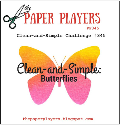
And since I had butterflies on the brain, how about the Paper Players' challenge:


I'm not 100% sure this card counts as CAS...I would have used the Shimmery White as the card base, but of course it kinda warps when you wet it so I needed to glue it down to something.


This pic kinda gives you an idea of the bling on this card--not just the gold foil butterfly, but the shimmer on the white cardstock.

We are fast approaching naptime (kid is now squirming around on his blanket on the floor, he seems happy), so I'm hoping to get some scrappin' done today.  Cheers, y'all!

Supplies, all SU!
Stamps:  Gorgeous Grunge, Happy Happenings
Ink:  Powder Pink, Tranquil Tide
Paper:  Tranquil Tide, Shimmery White, Pool Party, Gold Foil
Accessories:  Butterfly Thinlits

Monday, May 22, 2017

Horseback Riding (Wales)

It's a rainy scrappy Monday, y'all.  How was your weekend?  I was really really hoping to finish up my honeymoon album over the weekend, but it took a lot longer than expected to clean house yesterday so I still have two layouts to finish up.  One just needs journaling, but the other one has some work left to do.  I know what I'll be doing during naptime today!

Anyway, I do have a scrapbook layout to share today!  Something pretty simple.


Pictures are from our 2014 road trip through Wales; read the original blog post here.  I think it was another cloudy/rainy day when I took the photo of this layout, it came out kinda dark.  Well, dang.  It seems like I'm doing a lot of layouts lately with only horizontal photos, and there's only so many ways you can arrange a bunch of horizontal photos if you're not cropping them much.  Ever get the feeling that your pages are all starting to look alike?  Well, at least the colors change...


Super-simple title with Rough Type and Jayne's Type.


Here is today's color palette:  Perfect Plum, Marina Mist, More Mustard, and Whisper White.   It looks prettier IRL than the pictures make it look.

Anyway, I've got a squirmy babe in my lap and I'm trying to eat breakfast, so I'm going to sign off.  Cheers, y'all!

Supplies, all SU!
Stamps:  Jayne's Type Alphabet, Rough Type
Ink:  Marina Mist, Perfect Plum marker
Paper:  Perfect Plum, Marina Mist, More Mustard, Whisper White, Autumn Vine DSP, Marina Mist & Perfect Plum DSP
Accessories:  None

Friday, May 19, 2017

Dream Castle

Happy Friday, y'all.  Man, this week has gone by fast!  I'm feeling pretty good about my craft room productivity though.  I loooooove naptime.  I'm lucky--I can put the kiddo down in his crib, turn on the white noise, and within ten minutes he's asleep.  Pretty much every single time.  It's awesome.

So usually I would do a Friday Flashback post today, but since I have some stamp sets that haven't seen ink yet and are on the retiring list I thought I'd bust out one of those today instead.


I'm in love with this stamp set, called Chase Your Dreams, and it's on sale now!  Get it before it's gone.  In addition to this castle, the images include the Empire State Building, the Arc de Triomphe, Tower Bridge in London, and the Sydney Opera House.  Is it weird that I'm kinda glad they steered clear of doing the Eiffel Tower in this stamp set?  I feel like the Eiffel Tower gets a lotta love so it's nice to see some other famous landmarks.  And I HAVE seen all these famous landmarks except the opera house :D

I used the color combination from Create with Connie and Mary:


I wouldn't have thought to put these three colors together and I LOVE IT.  I'm planning a scrapbook layout with this combination.  Anyway, I thought these colors would be perfect for Neuschwanstein:


This is the castle that Walt Disney used for inspiration for Sleeping Beauty Castle in Disneyland, and you might remember it from Chitty Chitty Bang Bang.  It's also the first castle I ever visited that wasn't in a Disney park ;)  I need to do my own scrapbook pages from when the hubs and I visited.  Picture above is NOT one we took...I don't know where you'd have to go to get that particular view but I think there would be some mountain climbing involved.  We do have some lovely shots of it taken from over to the left, so you can't see the front facade of the castle but you can see how far back it goes.

Anyway.  I also snitched the layout from Dawn Olchefske's blog:


I like it!

That's it for me today.  I'm going to make the most of naptime...cheers y'all!

Supplies, all SU!
Stamps:  Chase Your Dreams (buy it now!)
Ink:  Night of Navy, Calypso Coral, Mint Macaron
Paper:  Night of Navy, Shimmery White, Blooms & Bliss DSP, Fruit Stand DSP
Accessories:  Lots of Labels Framelits, Dimensionals

Thursday, May 18, 2017

I Heart Dragonflies

Heyyy I made another card this week!  I'm also making good progress on the honeymoon album...SO ready to get that done.  But anyway, card!


I loooooove the Dragonfly Dreams bundle from the Occasions catalog, which is happily carrying over to the big catty.  But for today's card I just used the Detailed Dragonfly Thinlits along with some stamps that are on the retiring list, Gorgeous Grunge and Love & Affection.  I think they're only retiring Gorgeous Grunge because *everyone* owns it now (let's be honest, I've used this splatter stamp more than all the other stamps in the set put together!).  I love Love & Affection for that super pretty font on the sentiments, so I wanted to revisit it before it retires.  Not that it will be leaving my collection because #hoarder.

So this card came together super fast with the help of this week's Freshly Made Sketch:


I followed the sketch pretty much exactly this time :D  I also used this week's Color Throwdown:


I thought these would be perfect colors for a dragonfly card.  I used Tempting Turquoise, Cucumber Crush (sad to see it retire too), and Crushed Curry for my colors.  The background was made by scribbling on the largest acrylic block with markers, spritzing with water, and then "stamping" it on Thick Whisper White cardstock, love that technique for superfast watercolor backgrounds.  I'm very happy that you can actually see the Wink of Stella glimmer on the dragonfly too!

So on Mother's Day, my sweet Ryan made a card for me:


I suspect his daddy helped him (after all, Ryan is just 3 months old and not really writing much yet), but it looks like he took dictation.


And there's authentic-looking drool marks on the inside.  I love it!

That's it for me today.  I'm hoping to put Ryan down for a nap soon and then finish up the scrapbook layout I started yesterday.  I actually think I get pages done *faster* since I had Ryan because when I get him to sleep I'm all like MUST WORK FAST DO NOT WASTE NAPTIME!  I've always worked best under pressure ;)

Cheers y'all!

Supplies (first card), all SU!
Stamps:  Gorgeous Grunge, Love & Affection
Ink:  Crushed Curry & Cucumber Crush markers, Basic Black
Paper:  Cucumber Crush, Tempting Turquoise, Thick Whisper White
Accessories:  Detailed Dragonflies Thinlits, Wink of Stella pen

Wednesday, May 17, 2017

St. Isaac's Cathedral

Sooooo I was planning to make a card yesterday to post today, but instead I knuckled down and worked on that honeymoon album a bit.  Once I do some journaling and a wee bit of stamping, I'll have three more layouts completed for it which means only FIVE more left!  Woo.

So anyway, how's about some more scrapbook pages today!


Wow, that picture is crooked.  Tilt your head to the right ;)  Pictures are from another cathedral in St. Petersburg that we visited when we went on our Baltic cruise in 2014 (wow, three years ago already!).  See them close up here.  My favorite thing in this cathedral was the malachite columns, which you can see behind me in the picture on the bottom of the right page, so I decided to highlight them a bit by making my page base Emerald Envy.  And then that led me to the Moroccan DSP, which is retiring along with the Moroccan Nights stamp set.  Get that stamp set ASAP, I love it!  I'm sure it will make several more appearances in my scrapbook pages.


My title today is brought to us by the long-retired Letterpress and Rough Edges alphabets.  There's no apostrophe in the Letterpress Alphabet set, so I stamped the dot from the exclamation point (also used for the period), and then drew in the tail to make the apostrophe.


Some stamped accents to match the patterned paper.


I took the color palette directly from the Moroccan DSP:  Emerald Envy, Dapper Denim, Delightful Dijon, Early Espresso (I know it looks black, but it's not), and Very Vanilla.

Sounds like the kiddo wants his next bottle, so I'd better scarf down the rest of my breakfast so I can take care of him.  Cheers, y'all!

Supplies, all SU!
Stamps:  Letterpress Alphabet, Rough Edges Alphabet, Moroccan Nights
Ink:  Dapper Denim, Early Espresso
Paper:  Emerald Envy, Dapper Denim, Delightful Dijon, Very Vanilla, Moroccan DSP
Accessories:  square punches, postage stamp punch

Tuesday, May 16, 2017

Perfect Mix

Hey kids!  I'm trying to get back to posting a little more often.  Plus maybe I'm procrastinating just a teeny bit on finishing up my honeymoon album...but I do plan to finish that by the end of the month.  I've gotten several new stamp sets since the beginning of the year that I haven't used yet...I blame the kid ;) So today I put some ink on one of them!


As an avid baker, you KNOW I had to get the Perfect Mix stamp set from the Occasions catalog.  Other images include a hand mixer, a grater, oven mitt, spatula, mixing bowl, and a dozen eggs, plus several sentiments.  I thought I'd use these measuring spoons and give this to my hubs to say thank you for the great Mother's Day.  Ryan can't read yet, so I don't need to make him a card, right?  But anyway, since it's for my hubs I kept the card really simple.  I cut a circle out of the stripey paper and mounted the main image on that bit with Dimensionals, and now I have a circle of stripey paper I can use for something else.  But I thought doing a mat around the image that way was a little different while still being very simple.

I used the latest color combo from Fab Friday:


I never really thought about putting Calypso Coral and Rich Razzleberry together, but there's a DSP stack in the new catalog that has those two colors together so I'm trying to wrap my brain around it.  Even so I only used a wee bit of Rich Razzleberry ink on my card ;)

This week's Global Design Project theme challenge was the perfect excuse to ink up this stamp set:


YES PLEASE.  I continue to be obsessed with making variations on Sally's master muffin recipe, I think the next two I'll try will be strawberry chocolate (I have strawberries in the fridge right now, just need some mini chocolate chips!) and raspberry white chocolate.  YUM.

That's it for me today.  I'm off to work in the craft room while Ryan is asleep...I like this morning naptime thing ;)  Cheers!

Supplies, all SU!
Stamps:  Perfect Mix
Ink:  Basic Black, Dapper Denim, Calypso Coral, Rich Razzleberry
Paper:  Dapper Denim, Thick Whisper White, Calypso Coral DSP
Accessories:  Stitched Shapes & Layering Circles Framelits, Dimensionals

Monday, May 15, 2017

Notre Dame

Scrappy Monday, y'all!  How was your weekend?  Yesterday was my first (human) Mother's Day...after all, I've been a dog mama for over a decade ;) But this was the first year I've had a tiny human child on Mother's Day.  So the hubs and Tiny Human Child made me waffles for breakfast (yum!), then I got to go get a massage and a facial (which I found out about 10 minutes before I got there!), and then the hubs and I went to see Guardians of the Galaxy 2 while Tiny Human Child entertained some friends.  Pretty awesome first human Mother's Day, I think.

Anyway, it's time for a scrapbook layout!  Coincidentally, today's pages are from our first trip to Paris, which was also a surprise to me...although this time I found out about it about a week before we left.


See the pictures up close and personal here and here (we went to Notre Dame on two different days, hence the blue, blue sky in one photo and the overcast skies in all the other pics).  I did this layout either right before or right after the Nijo Castle one, remember how I said I tend to use a color several times?  More Elegant Eggplant, right here.  I paired it with Kiwi Kiss and Cameo Coral from the Raspberry Tart DSP (one of my all-time favorite packs), and some Bordering Blue mats on the photos.


I've used the Empire Alphabet and that Eiffel Tower image from Artistic Etchings on all my Paris pages from this trip, so they all look like they go together without having to be all the same colors or anything.  And take a closer look at that patterned paper, isn't it GORGEOUS :D


As I mentioned above, today's color palette includes Elegant Eggplant, Cameo Coral, Kiwi Kiss, Bordering Blue, and Whisper White.  And the middle three colors are now all retired.  I do use a LOT of retired stash in my scrapbooks...that's why I have it, right?

Okay, Tiny Human Child is now asleep, so I'm going to do some dishes and maybe sneak down to the craft room while he naps.  I'm working on a big project right now and I've got 7 layouts left to do, but I'm getting a little unmotivated because it's a very limited color palette and I kinda wanna work on something else for a hot minute.  So maybe I'll do one layout of something else and then come back to this project...hoping to start unveiling it in the next week or two.  I WILL finish it by the end of the month!  #goals

Cheers, y'all!

Supplies, all SU!
Stamps:  Empire Alphabet, Artistic Etchings, Hello Lovely
Ink:  Elegant Eggplant, Bordering Blue
Paper:  Elegant Eggplant, Bordering Blue, Whisper White, Raspberry Tart DSP
Accessories:  Lots of Labels Framelits

Friday, May 12, 2017

More Happy New In Colors!

While I had the stamps and dies out for yesterday's card, I just had to make a second one with the other two new In Colors :D


Meet Berry Burst and Powder Pink, which I paired with longtime favorite Wild Wasabi.  I keep wanting to call that first color Berry Blast instead, I have to look every time to make sure I write the right name.  But it's probably my second favorite of the new In Colors.  Maybe.  I'm really liking all of them, but at least I know Tranquil Tide is my favorite ;)

Anyway, for today's card I used the sketch challenge from Global Design Project:


That bold stripey paper is retiring along with the stamps and Thinlits, I'm going to miss it.  I wish I'd gotten an extra pack of the Bold Brights prints...let's ignore exactly how much patterned paper I already have okay?  Because I neeeeeeed it all.  Obviously.

Once again this fits with the Retro Rubber Challenge:


And my stamps are still about three years old ;)

Have a great weekend, y'all!  Cheers.

Supplies, all SU!
Stamps:  Flower Patch
Ink:  Berry Burst, Powder Pink, Wild Wasabi
Paper:  Berry Burst, Powder Pink, Whisper White, Wild Wasabi DSP
Accessories:  Hello You Thinlits

Thursday, May 11, 2017

Happy New In Colors!

Heyyy lookit that, I made a card!  Actually I made two, I have another one to share tomorrow or Saturday.  Anyway, I got my new catalog preorder with the new In Colors and I just had to bust 'em out!


Oooooooohhhh I love new colors.  That, my dears, is a card made with Fresh Fig, Lemon Lime Twist, and Tranquil Tide.  So far Tranquil Tide is my favorite; it reminds me of the deep bluish green on the Stoney Creek cross stitch patterns I used to stitch when I was a kid.  And I thought these three new colors fit pretty well with the Cupcake Inspirations color challenge:


Pretty.  I also used this week's Freshly Made Sketch:


I paired the brand new colors with some flower stamps that are retiring, so this fits with the Retro Rubber Challenge:


Pretty sure I've had Flower Patch for about three years, and I've made quite a few projects with it.  The Hello You Thinlits are retiring as well, also a favorite here at Snapdragon Stamps.  But just because they're retiring doesn't mean they're leaving my craft room.  I'm like a dragon with her hoard when it comes to crafty supplies ;)

My little baby Sodapop is doing tummy time on the floor next to me while I eat breakfast (homemade apple cranberry muffins, thanks again to Sally's fabulous muffin recipe!), but I'm hoping he'll take a nap here in a little bit so I can go work in my craft room again.  I'm working on a scrapbook project and I also really want to play around more with these new colors...

Cheers, y'all!

Supplies, all SU!
Stamps:  Flower Patch
Ink:  Fresh Fig, Lemon Lime Twist, Tranquil Tide
Paper:  Fresh Fig, Lemon Lime Twist, Tranquil Tide, Whisper White
Accessories:  Hello You Thinlits, hole punch

Wednesday, May 10, 2017

Nijo Castle

Hey y'all, how's your Wednesday going?  I'm working on getting Ryan on a regular schedule for feedings and naps, so wish me luck with that.  Although he is asleep right now, so I call that a win.

Anyway, we're back to Japan for today's scrapbook layout.


See the pictures here if you're interested.  Nijo Castle is in Kyoto, Japan, which we visited in October of 2009.  I skip around a lot when I'm choosing pictures to scrapbook, but I am making an effort to get my older pictures scrapped sooner rather than later.  I'm afraid that I've forgotten details for most everything before I started my blog, so journaling those pages will be interesting :p  It really does help me to look at old blog posts when I do journaling on my scrapbook pages.


My page title.  Instead of using white or vanilla for the title block and journaling block, I went with Sahara Sand, just for something a little different.  I meant to use Elegant Eggplant for the page base, and it wasn't until I had a bunch of stuff stuck down that I realized I accidentally used my last two pieces of Eggplant Envy instead.  Yes, it's still purple, but it's a few shades lighter than Elegant Eggplant--you can see the photo mats on the bottom of the pages are darker purple than the background.  It's okay that I used the lighter color, I think it still looks fine, but I wish I'd realized before I stuck things down so I could have made a conscious decision whether or not to use up the last of my Eggplant Envy.  I may have color hoarding problems.


Today's color palette:  Elegant Eggplant (and Eggplant Envy, but I don't have a cardstock swatch for it since I'm now completely out of that color), Taken with Teal, Old Olive, and Sahara Sand.

I'm off to do dishes and maybe even work in my craft room before Ryan wakes up.  Cheers, y'all!

Supplies, all SU!
Stamps:  Lovely Letters Alphabet, Sweet Shoppe Alphabet, Bella's Bloom
Ink:  Elegant Eggplant, Taken with Teal, Sahara Sand
Paper:  Elegant Eggplant, Eggplant Envy, Taken with Teal, Old Olive, Sahara Sand, Sweet Pea DSP
Accessories:  None

Monday, May 8, 2017

Favorite Eats

Scrappy Monday, y'all!  Okay, so every day that I post is a scrappy day on the blog lately.  Haven't made a card in weeks but man, am I scrappin' up a storm.  So today I'm sharing one of the ten (TEN!) layouts I made last week!


The photos are from our last few weeks on Okinawa, when we hit up all our favorite restaurants one last time before leaving the island (see them all here).  I'm digging the bright colors I used on this layout, and especially those bold bright patterns from the Sweet Taffy DSP pack (retired, because I have a huge paper hoard!).


Yet another mixed-font title, but this one was super easy because the "favorite" was already a stamp by itself from the set Wonderful Favorites, so this title was really quick to stamp.


Today's color palette:  Coastal Cabana, Melon Mambo, Daffodil Delight, Island Indigo, and Whisper White.  LOVE. IT.

I think we're starting to get a routine established with Ryan, which is lovely.  We stopped swaddling this weekend because he flipped himself from his back onto his front, so now he's just sleeping in jammies.  We think he might wake himself up more often because he can move his arms freely, but he seems to be pretty good about putting himself back to sleep so I may be getting more sleep here soon too!  I still wake up a lot even if he's not making noise.

Anyway, I'm off.  I have yet more scrapping to do...I think I'm going to work on my honeymoon album!  I so want to finish that just so I can call one project completely donesies.  Cheers, y'all!

Supplies, all SU!
Stamps:  Wonderful Favorites, Letterpress Alphabet
Ink:  Coastal Cabana, Island Indigo
Paper:  Coastal Cabana, Island Indigo, Melon Mambo, Whisper White, Sweet Taffy DSP
Accessories:  None